

Overview
Booking.com strives to make travel more accessible to everyone. It connects travelers to amazing accommodation choices – from cozy homes to luxurious hotels. The website aims to create an easy booking experience for potential travelers, whether for business or leisure.
This project aimed to reveal potential problems that may occur during the user’s journey and pinpoint areas of needed improvement.
Goals:
- To explore users’ challenges when booking accommodations with multiple requirements.
- Identify the methods users use to acquire property information.
- Analyze the user process for comparing listings
- Evaluate the simplicity of the (non-account-based) email sign-up process.
Role: UX Researcher
Methodology
Recruitment
Seven participants were recruited in person and online through social media and group discussion platforms. Unmoderated testing was carried out on Android OS devices and Apple iPhones using the Loop11 and UserZoom Go testing platforms from July 6th to July 17th, 2023.
Testing Details
Remote mobile sessions were conducted using UserZoom Go and Loop11 testing platforms. Participants encountered technical issues such as service degradation, application crashes, and device incompatibility.
Before beginning their session, participants received an informed consent statement and were given the option to withdraw at any time. Participants were prompted to think out loud and verbalize their thought process.

At the start of each session, the study asked participants to review booking.com’s homepage and share their thoughts on what the website offered. Later, the participants answered questions about a previous task or provided feedback after the testing session ended.
Testing duration averaged 24 minutes and 44 seconds between the 7 participants.
Participants
Individuals of various ages and genders were recruited to participate. Two male and five female participants between 20-55 years old were asked to complete a series of tasks and asked questions about their experience. Only two participants gave permission for their phone’s camera to be on to record non-verbal cues and reactions.
| Participant 1 Late 30s, Male Lyndhurst, OH Session Duration: 25: 46 Userzoom Go iPhone | Participant 2 Late 30s, Female Savannah, GA Session Duration: 15:45 UserZoom Go iPhone | Participant 3 Late 40s, Male Strongsville, OH Session duration: 11:30 Loop11 iPhone Frequent Business Traveler | Participant 4 Early 20s, Female Cincinnati, OH Session duration: 35:35 Loop11 iPhone |
| Participant 4 Mid 20s, Female North Olmsted, OH Session duration: 34:05 Loop11 Android | Participant 6 Early 50s, Female Twinsburg, OH Session Duration: 13:47 Loop11 Android | Participant 7 Early 30s, Female Cleveland, OH Session Duration: 13:30 Loop11 iPhone |
Unmoderated usability testing involves asking users to perform predetermined tasks using a design or interface without the ability to ask follow-up questions or complete additional tasks.
The following outlines the 7 unmoderated tasks asked of participants during testing, as well as their responses and recommendations for improving Booking.com’s mobile site. Skip to the conclusion.
Task 1
Explore Booking.com Homepage
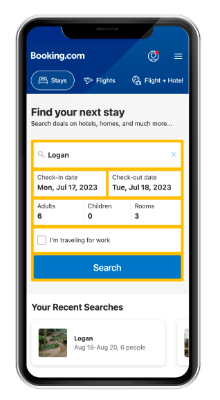
“For today’s tasks, you’ll be using Booking.com. Take a moment to review just the homepage and describe what you see and its offerings. What is the purpose of Booking.com?”
Findings
Task Completion Success Rate: 7/7
Mean Time on Task: 1 minute, 40 seconds.
Average page views: 2.2
“This site helps with all things travel. It might have initially started with hotels…overall travel experience.”
”Assuming this is a big website that partners with companies, maybe?”
Recommendations
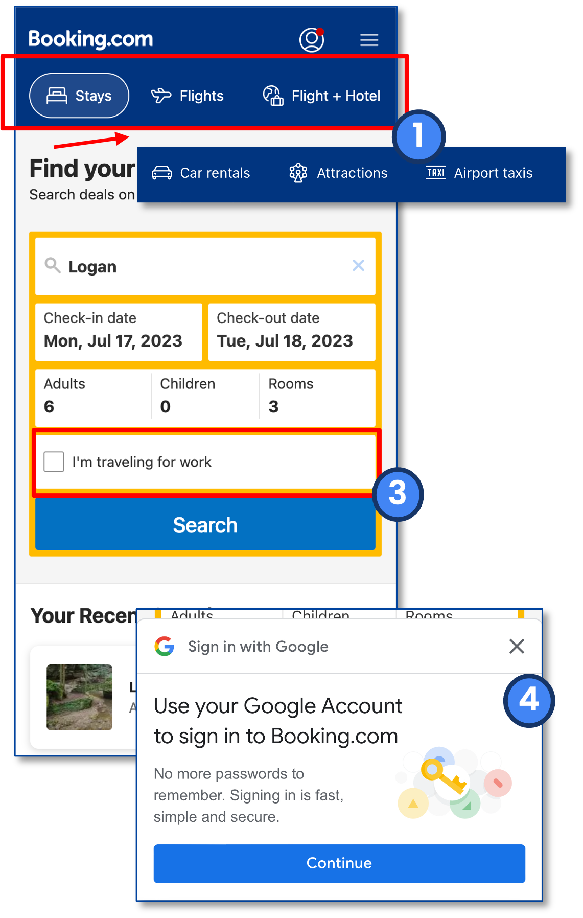
- Many participants missed the additional sub-navigation options (car rentals, attractions, Airport taxis).
- Provide an affordance (that the menu has more options) to encourage horizontal scroll.
- Provide an affordance (that the menu has more options) to encourage horizontal scroll.
- Multiple participants questioned the reasoning for the “I’m traveling for work” checkbox.
- Multiple participants indicated that some filtering should be available before browsing results.
- Provide a few top filters on the main homepage search box.
- Provide a few top filters on the main homepage search box.
- Google Sign-in and “Genius” popped up multiple times, and participants expressed annoyance.
- Once users dismiss the lightbox modals, they shouldn’t trigger again until the next visit/session.
Task 2
Niagara American Side
Scenario: You will be traveling to Niagara Falls (USA side) for a weekend from August 18-20, 2023. Find a room on the American side that you would like to reserve.
Findings:
Task Completion Success Rate: 7/7
Mean Time on Task: 3 minutes, 15 seconds.
Average page views: 13.9
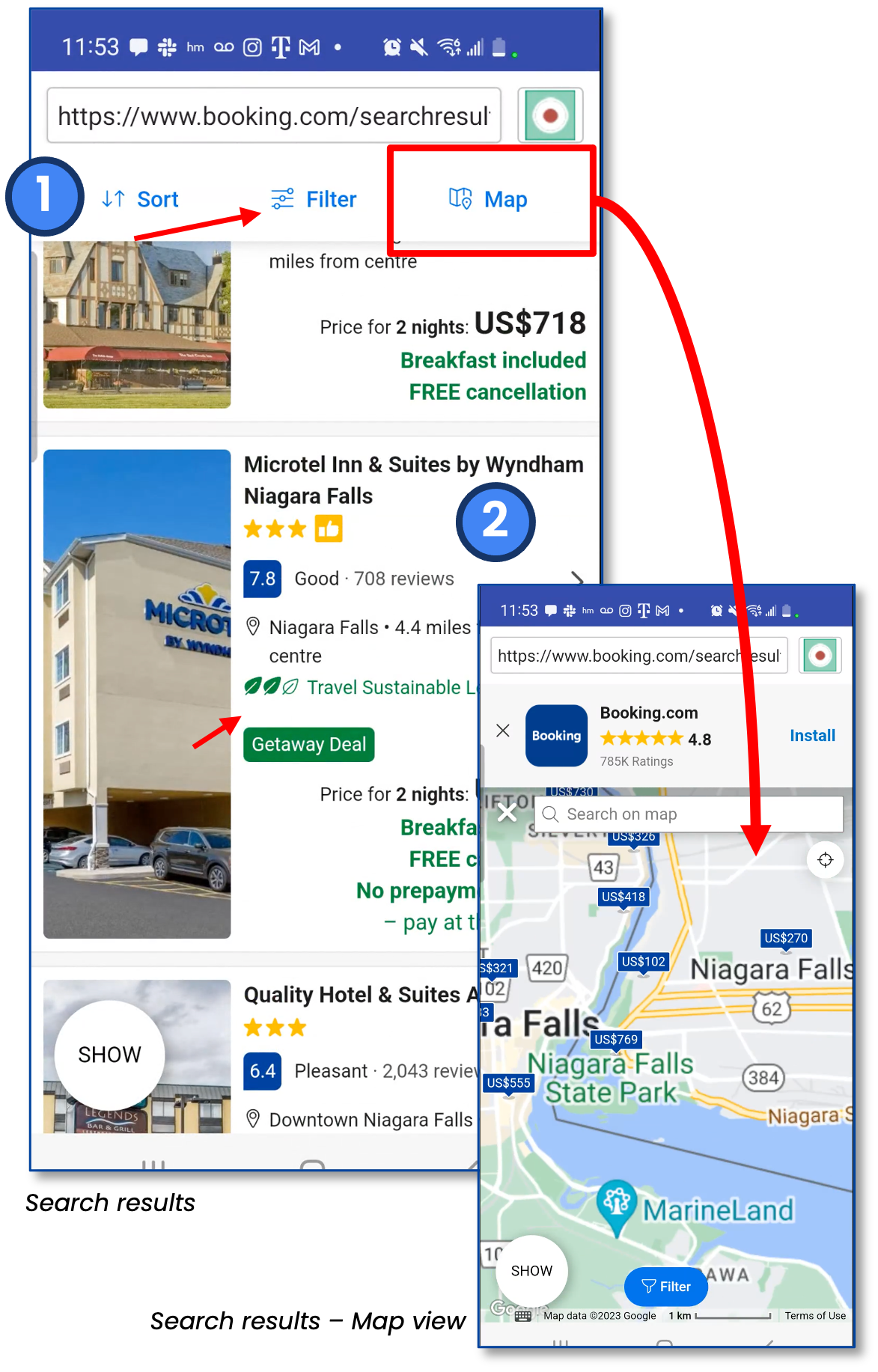
- Most participants were able to find filter & refinement options in search results quickly, though not all chose to use filters immediately.
- Some looked for high-rated hotels, while others took notice of travel sustainability levels.
- Multiple users used the “map view” to ensure they got a location on the American side of the Falls.
Recommendations
- Keep all three refinement options and make them “pop”, as they can get lost among the listing details.
- Or reduce some of the listing clutter.
“Sustainability levels? I wonder how many people look at that when picking where to stay”
“It would be cool if the map had a toggle on/off for safe neighborhoods….because sometimes you get to hotels and they’re in sketchy locations.”
Task 3
Niagara Amenities
Scenario: Your visit to Niagara Falls (from 8/18-8-20) has suddenly become a friend’s trip, and you need to accommodate six adults. Your friends desire to stay at a location that offers both a pool and breakfast service.
Findings
Task Completion Success Rate: 7/7
Mean Time on Task: 2 minutes, 27 seconds.
Average page views: 14.3
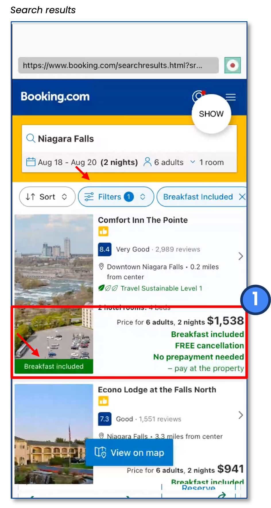
- Participants were able to filter their results and find places that included breakfast and pool options.
- Multiple participants expressed frustration when search filters didn’t meet their stay requirements.
- Multiple participants didn’t see breakfast callouts due to a cluster of green on results and checked the property’s amenity details to confirm.
“I selected 3 rooms, and it’s showing me only 2 rooms and 4 beds. I’m a little frustrated because it’s not giving me 3 hotel rooms like I asked for.”
Recommendations
- Limit callouts in green to filters selected or add icons & spacing to make highlights stand out.
- For example, a food icon for when breakfast is included.
- Make sure listings are filtered out by the required criteria. For example, don’t show 2 room options when users have asked for 3 rooms.
Task 4
Email Sign Up
Scenario: You want to register for email deals on hotels without creating an account. Find where you can do that on the site.
Findings
Task Completion Success Rate: 2/7
Mean Time on Task: 2 minutes, 02 seconds.
Average page views: 6
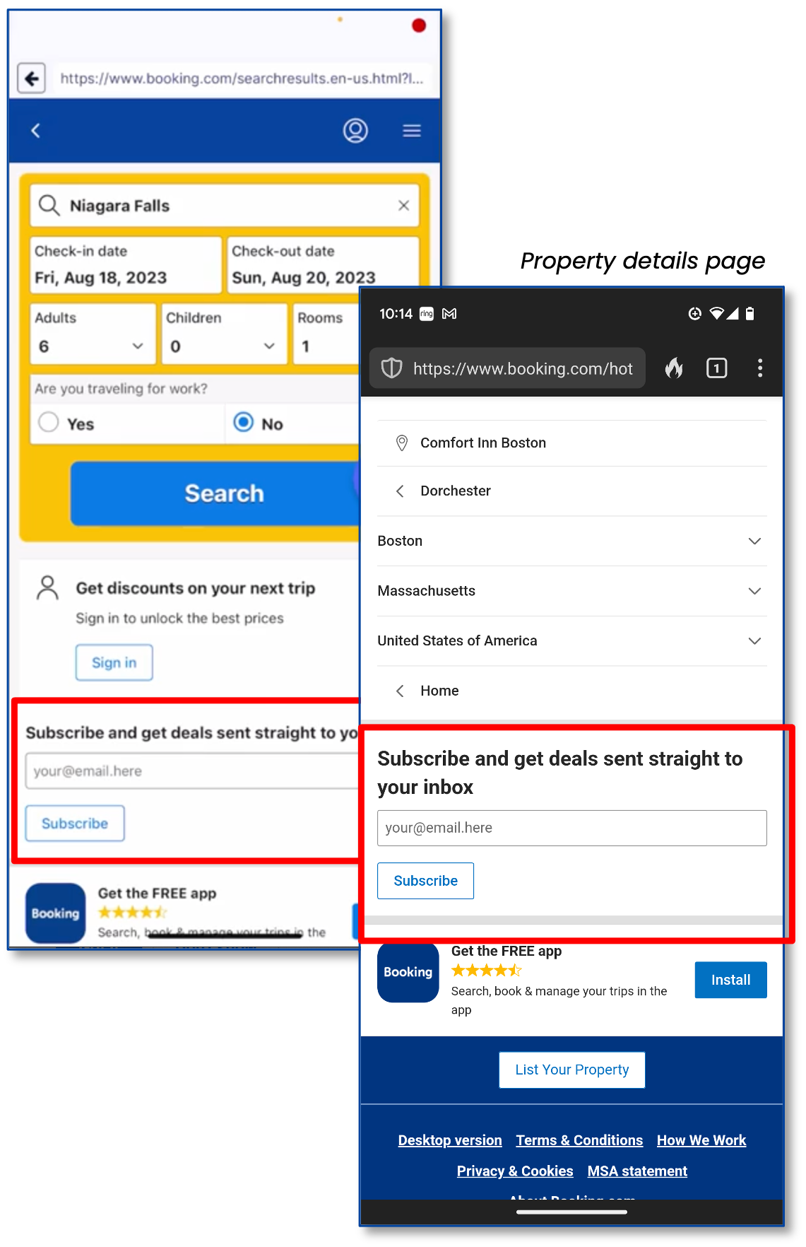
- 5 out of 7 participants could not find the email sign-up and looked in the menu and footer of the homepage.
- Multiple participants expressed they wouldn’t want to sign up/in or download an app to get deals.
- 2 of the 7 stumbled upon email sign-ups accidentally or during later tasks.
”….Oh hey, I found the email sign-up finally.”
Recommendations
- Don’t hide the email sign-up option—on mobile, place it in the main menu or footer (like on the desktop experience).
Task 5
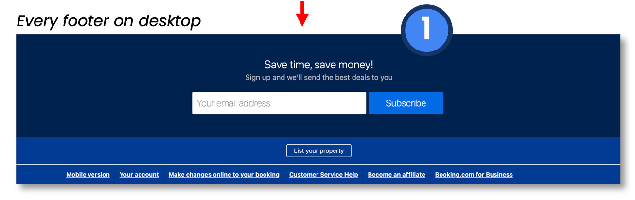
Hocking Hills Accessibility
Scenario:
You’re planning a family trip to Hocking Hills in Logan, Ohio, from May 12-16, 2024. Find a place to stay for three adults and two kids under six years old. One of the adults requires wheelchair access.
Findings
Task Completion Success Rate: 5/7
Mean Time on Task: 2 minutes, 42 seconds.
Average page views: 15.3
- 3 of 7 participants missed or were confused about the “facilities for disabled guests” filter.
- Participants used words like ”handicap”, “wheelchair accessibility”, & ”ADA accessible”.
”Oh! facilities for disabled guests… I feel like that’s such a weirdly worded phrase”
“I’m finding nothing for a handicap room”
Recommendations
- Make accessibility filtering visible on the mobile site like it is for desktop users.
- Test alternative wording for the “disabled guests” option.
Task 6
Early Check-In
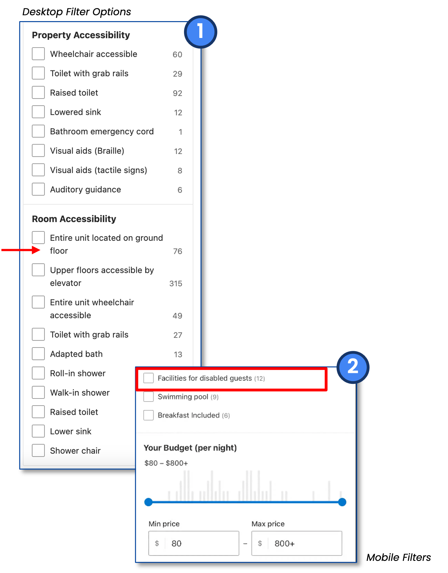
Scenario: Assume a place near Hocking Hills looks perfect, but you want en suite details and if you’re allowed to arrive before 3 pm. What would you do?
Findings
Task Completion Success Rate: 0/7
Mean Time on Task: 3 minutes.
Average page views: 6.3
- Most participants checked property descriptions, facilities details, and/or filters for check-in or early check-in times.
- 3 of 7 missed or could not find check-in times.
- 4 of 7 participants said they’d call the hotel directly to see if they could check in early.
“Hmm…I don’t really see an option [to check in early]”
ok…when can I check in? I feel like I would call in. Where is this detail? I’m sure it has it on here somewhere… I don’t think it would be in facilities… I don’t even see where you can do this.”
Recommendations
- Highlight check-in times so they are bolder, stand out, and higher in the page’s hierarchy (with or near other details). Don’t hide or bury.
- Include information or a link about the property’s early check-in policy so users don’t have to call.
Task 7
Business Trip Booking
Scenario: You’re planning a one-day business trip to Boston, MA, near the Convention Center on October 2-3, 2023. Your boss wants a small list of hotel options for price comparison before approving the trip.
Findings
Task Completion Success Rate: 2/7
Mean Time on Task: 3 minutes, 40 seconds.
Average page views: 9.7
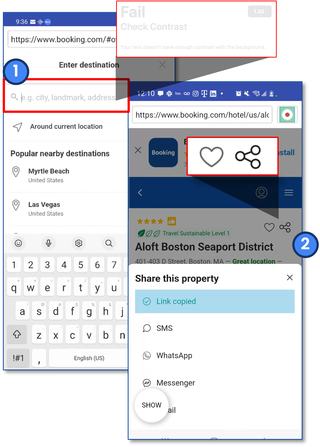
- Many participants didn’t know how to search for landmarks like ”convention center”.
- Only 2 of 7 found the share button to “compile a list” to email.
- No participants used the heart icon to add properties to a favorites list.
”I would just send some screenshots of each of these [listings].”
Recommendations
- Make example search criteria stand out more.
- Hint text is not currently contrast compliant.
- Provide examples or hints of how to search (eg “Tuscon, AZ” or “Grand Canyon National Park” or “1575 E. 36th St…”)
- Share, lists, and comparison tools need to be more discoverable and comprehensive.
Follow Up Comments
Participants were asked, “What do you think about your experience today at booking.com? What did you like and dislike? What could be better? What additional questions or comments about booking.com do you have?”
“Hard to get an idea of what a hotel is like based on images. I liked how it showed some of the amenities on the page…Overall I liked the platform.”
“I liked the interface. Relatively easy to navigate. Rooms have pictures listed. I don’t like how there aren’t any reviews to tell about the downsides of a hotel.”
“Much easier than other sites I have used in the past. I like that each page shows a lot of info… Would like if there was a search icon on home page.”
“Why is the VIP section called geniuses? Explorers would make more sense.”
“What is [Genius] about? Is this
their frequent flyer program?“
Conclusion
Most participants completed the study with positive outlooks on the site, despite some hang-ups they encountered. Most notably, participants commented that the interface was easy and similar to other sites.
For a cohesive user experience, the mobile website should offer the same features as the desktop version. This ensures seamless functionality across all devices for all users.
It would be ideal to test all the different functionalities and offerings on the site. The recommended changes documented here should be the first step before moving on to the flight booking functionality testing.
To ensure comprehensive testing, it is advisable to conduct tests on various user groups for each section of the website. This includes testing novice and infrequent travelers as well as a more experienced group of frequent flyers.
Note: Booking.com did not commission this usability test.
Got a similar project?
Contact me to see how I can help!