Overview
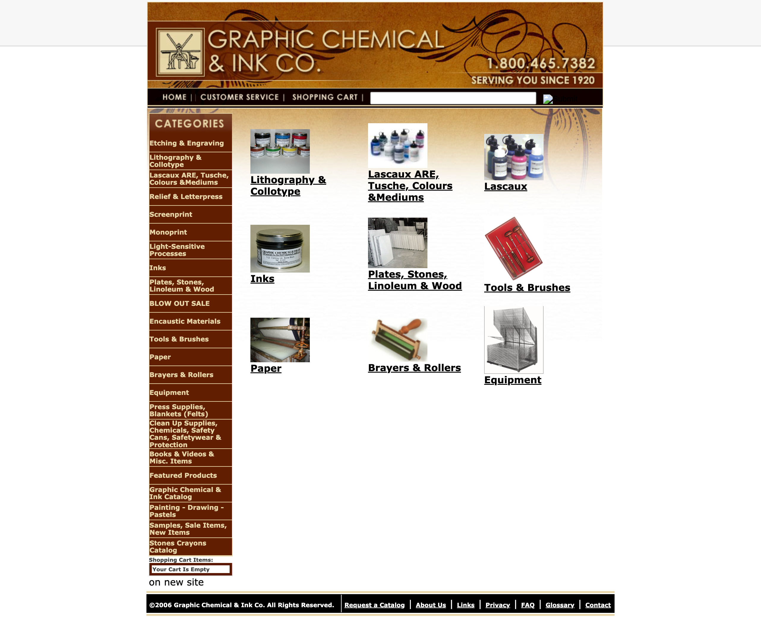
This project outlines the findings of an accessibility assessment carried out on Graphic Chemical & Ink Company’s website from January 28th to February 4th, 2024.
This project report offers detailed recommendations on how to meet the Level A or AA compliance criteria of the World Wide Web Consortium’s Web Accessibility Initiative (W3C WAI) for Web Content Authoring Guidelines (WCAG) version 2.1.
Goals
The goals of this project were to conduct an accessibility evaluation of graphicchemical.com using three evaluation methods:
Automated Code Inspection
- Evaluate how compliant the website is based on WCAG guidelines from a code-based perspective.
- Provide quick analysis of errors and specific guidelines they may violate.
Manual Code Inspection
- Find issues that an automatic code inspection couldn’t determine from a qualitative perspective. Example:
- If image descriptions are precise and useful.
- If elements are relevant to their surroundings.
Experience Walkthrough
- How well does the site support using assistive devices such as screen readers & magnification?
- The degree to which the site is navigable without a mouse or trackpad.
- Whether the pages allow visitors with disabilities to understand where they are and what they can do on the site.
Role: Accessibility QA Tester
Scope
This evaluation covered the following areas of the site:
- The homepage
- Search for an item from the homepage and interact with search results.
- Interact with a product page.
Methodology
The following are the three methods used to evaluate graphicchemical.com and grade its success criteria using WCAG 2.1.
Automated code inspection
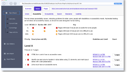
A software tool (SortSite) automatically scanned Graphic Chemical’s website for accessibility errors. While this method thoroughly evaluates the website’s code for structural issues, the tool cannot make qualitative judgments about semantics, such as the descriptive text or the organization of elements on the page.
Manual Code Inspection
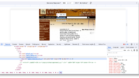
The website’s code was manually reviewed to ensure that the image descriptions were accurate and helpful. The review also checked if the elements on the page resized responsively and stayed relevant to their surroundings.
Experience Evaluation

The experience walkthrough method involved simulating the experience of using the site with assistive technologies, such as screen readers and mouse-free navigation methods. This approach provides a more realistic representation of the challenges that people with disabilities may face while interacting with the website.
Web Content Authoring Guidelines
The Web Content Accessibility Guidelines (WCAG) is documentation that explains how to make web content more accessible to people with disabilities.
WCAG 2.1 is a technical standard that can be tested against. It has 13 guidelines organized under 4 principles. Section 5 provides conformance guidance. For each guideline, there are testable success criteria at three levels: A, AA, and AAA. Both A and AA are the minimum legal requirement in the U.S. and the success criteria for this evaluation.
The Principles
Perceivable
- Provide text alternatives for non-text content.
- Provide captions and other alternatives for multimedia.
- Create content that can be presented in different ways, including by assistive technologies, without losing meaning.
- Make it easier for users to see and hear content.
Operable
- Make all functionality available from a keyboard.
- Give users enough time to read and use content.
- Do not design content in a way that is known to cause seizures or physical reactions.
- Provide ways to help users navigate, find content, and determine where they are.
- Make it easier for users to operate functionality through various inputs beyond the keyboard.
Understandable
- Make text readable and understandable.
- Make content appear and operate in predictable ways.
- Help users avoid and correct mistakes.
Robust
- Maximize compatibility with current and future user tools.
Results
Automated & Manual Code Inspection
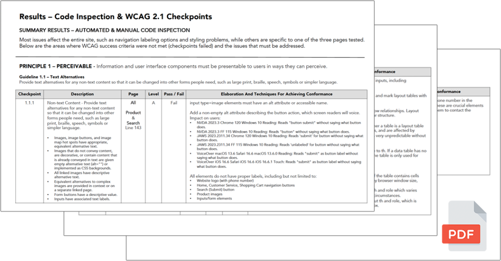
Most issues affect the entire Graphic Chemical site, including navigation labeling options and styling problems, while others are specific to one of the three pages tested. To review the details of WCAG success criteria not met and the issues to be addressed, please refer to the view the evaluation report (PDF)
Experience Walkthrough
GraphicChemical.com’s e-commerce platform is not accessible to people who use screen readers or magnification or do not use a mouse or trackpad. This issue should be addressed as it severely impacts potential customers’ user experience. During the accessibility audit, critical and severe issues were encountered that prevented users from navigating the website. The following summarizes found issues:
Magnification/Zoom
Severe Issue – Visitors may not be able to navigate or understand the site.
Evaluation Technology
A 13” Macbook Pro running Ventura 13.4.1 with a secondary 24” monitor was utilized. The software used is Mac’s native accessibility feature, Zoom, which allows users to magnify or zoom their screen in to see things larger on screen. The technology works in full and split screen mode as well as picture-in-picture. This technology is ideal for people who are hard of seeing or have low vision but still have some vision.
Recap
When the screen was initially magnified via macOS Zoom, moving left and right with the trackpad was not possible, but this may be due to a software bug, as using a mouse was possible.
The site was blurry, the text did not render smoothly, and the images were extremely blurry. Text is rendered only slightly smoother when using the browser’s built-in zoom capabilities.
The root cause of the problem is the outdated code styling used on the site. As a result, the elements and text on the website do not wrap responsively, making it difficult to read while zoomed in. Even the browser’s built-in zoom capabilities faced the same challenge with non-wrapping or non-responsive elements.
Recommendations
To address this issue, it’s advisable to rebuild the website using divisions (divs) instead of tables. Tables are often inflexible regarding sizing and don’t allow the content to adjust or wrap based on screen size and resolution. Moreover, it’s recommended to avoid setting strict sizing on elements and instead allow buttons and content to adjust based on screen size. This will make the site more readable, responsive, and user-friendly for everyone.
Keyboard Navigation & Screen Reader
Critical Issue: Completely inaccessible – unable to navigate or use the site.
Evaluation Technology
A 13” Macbook Pro running Ventura 13.4.1 with a secondary 24” monitor. The software used is Mac’s built-in accessibility VoiceOver screen reader and standard computer keyboard. This technology is ideal for people who are hard of
seeing, have low vision, or are wholly and legally blind. Keyboard navigation is ideal for those with physical limitations, visual impairments, or who don’t have a mouse.
Recap
It appears that the website is not accessible to users who rely on screen readers or keyboard navigation.
With screen readers, users would be unable to interact with the site or control their navigation. The screen reader keeps looping through the site with no evident navigation points, leaving users disoriented and frustrated.
In addition, the site lacks proper labeling and naming for all of its elements. This makes it difficult for users to understand and interact with the site since they cannot navigate and identify the various components on the page.
With keyboard navigation, users are not able to tab to any of the side menu content, and nothing shows a “focus” state (highlight) outside of form-like elements (search field, dropdowns, quantity boxes, etc.)
Recommendations
All links, buttons, and headers should be navigable using tabbing or arrow keys, and links and images should have labels to identify them.
Conclusion
During the evaluation of Graphic Chemical’s website, it failed to meet the WCAG guidelines in all four principle areas, including levels A and AA. Both the automated and manual code evaluations indicated issues with the codebase, and the experience walkthrough for screen readers and keyboard users revealed critical problems that made the site completely unusable through these methods.
It is highly recommended that the company seek the help of an experienced web developer who can build responsive e-commerce websites that comply with WCAG guidelines with modern code markup. Alternatively, if the company cannot hire an experienced developer, it can consider using an existing WCAG-compliant e-commerce platform such as Shopify.
Therefore, any changes can be made to the existing site while a new site is built, it’s recommended to prioritize the following:
- Ensure that all the functionalities and navigation are accessible through a keyboard.
- Provide alternative descriptions (alt tags) for images and labels (aria tags) for links.
- Add headlines, table headings, and group content semantically – including moving the add to cart button close to product listings.
- Convert all navigation links and header information to text.
- Display error messages near form fields using simple language to help users understand what went wrong.
- Test with real users of assistive technology to ensure usability.
Note: Graphic Chemical & Ink did not commission this accessibility evaluation.
Got a similar project?
Contact me to see how I can help!


